 |
|
| |
 |
|

MARVEL UK
INSIDE
THE AVENGERS #66
DECEMBER 1974
|
|
| |
| The Mighty
Avengers were introduced into the ranks of the black and white weekly Marvel UK reprints (launched
in late September 1972) in August 1973 in the pages of Mighty
World of Marvel #46 and almost immediately moved on
to their own weekly title in September 1973. For the
first 27 issues the 36 pages of each issue ran a full
Avengers story (reprinting one US issue in its entirety)
backed up with one of the early 10-page adventures of
Doctor Strange from Strange Tales. This formula
was changed with The Avengers
#28
in March 1974 when The Avengers began to feature
three characters and storylines from the Marvel Universe
as Shang-Chi, Master of Kung Fu, joined Earth's Mightiest
Heroes and the Sorcerer Supreme. So let's take a
closer look at the black and white content behind the
glossy cover of The Avengers #66, which went on
sale in the UK the week ending December 21st 1974.
|
| |

"...This
Spell I Break Asunder!"
Originally published
in Doctor Strange #173 (October
1968)
Original
story title: "While A World
Awaits!"
Script - Roy
Thomas
Pencils - Gene Colan
Inks - Tom Palmer
Lettering - Artie Simek
Original page count:
20
Reprinted pages: 10 (+ UK produced splash
page)
|
|

|
|
|
| |
| Since the very
first issues, the Sorcerer Supreme had served as
the backup feature, usually on the last pages.
This time, however, the Master of the Mystic Arts
was the cover star and hence, according to
established Marvel UK practice at the time, even
received a billing in the title of the comic
itself - THE AVENGERS featuring DR. STRANGE.
|
|
| |
 
|
|
Because
all
of Marvel UK's titles of the mid-1970s were
published weekly (in line with the general UK
comic book market setup) with 36 pages to an
issue, having three distinct characters and
storylines in one title meant that the original
material had to be cut up and serialized in order
to fit this format - and as a rule of thumb, the
content of one US issue was thus spread out over
two weekly issues in the UK. This
instantly caused a shortage of original US cover
artwork and also required new splash pages where
the UK reprint actually consisted of the second
half of an original issue. Which was precisely
the case with the Dr Strange installment, reprinting pages 11-20 from
the original US Doctor Strange #173.
Editorial
and the pencilling staff involved in this process
displayed some ingenuity in tackling this task,
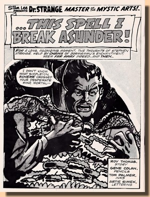
and one frequently used solution was to take a
single panel from an original interior page and
blow it up to full page size, adding title and
credit panels. This method was also applied here,
as the first panel on page 11 from the original
material was turned into a splash page. This
sometimes resulted in quite dramatic splashpages,
but in this case, blowing up the panel and
tilting it to the right even made Gene Colan's
pencils not look too good and hardly
recognizable. Which is probably why the editors
didn't feel that starting off the actual story
with the very same panel was a problem - besides
ignoring the fact that they goofed and put a
statement coming from Dormammu in Strange's
mouth...
The
story continues Dr
Strange's fight against the dread Dormammu, who
seeks to break open a portal to Earth at the
Doorway of Dimensions and finally enslave it.
However, the Sorcerer Supreme succeeds in
breaking free from the mystical chains which hold
him down and in a last effort, applying all his
mystical force and magic, Strange closes the
portal, foiling Dormammu's plans and defeating
him. The world is saved from a fate it never even
knew was looming, but Stephen Strange himself
finds no victory for himself as he can defeat the
dread Dormammu but not, it seems, conquer the
loneliness his powers force upon him.
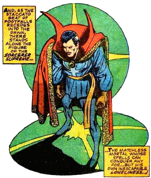
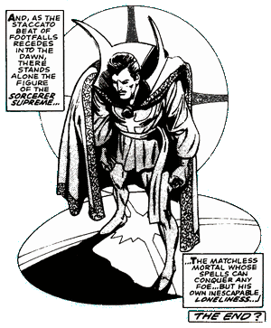
Interestingly, a
deviation from the original can be found in the
final panel of this story. Whilst it did end a
multi-issue story arc showing the hero in a
ponderous stance reflecting his own personal
vulnerability, Marvel UK editorial added an
additional text box with the caption THE END
?
|
|
| |
Was Marvel UK thinking of
dropping Doctor Strange as a feature in the pafes of the Avengers?
Reader opinion as voiced in the letters pages was always
somewhat divided over the Sorcerer Supreme. But letting
him go at this point would have been a shame - after all,
the original letter column of Doctor Strange
#173 stated:
"Dapper Dan
Adkins decided he wanted to stick to inking for a
while (so) we asked Gentleman Gene [Colan] to try his
hand at drawing the mystic master’s
exploits. We think that (...) with the
unique inking style of newcomer Tom [Palmer], the
current Dr. Strange is certainly one of the artistic
high points of panel-graphic literature!"
But in any case, the Master
of the Mystic Arts would continue until being pushed out
by the cancellation-displaced Conan as of Avengers
#95 (mid-July 1975).
The Dr Strange installment
is followed by a Bullpen Bulletin page plus two letters
pages (discussed in detail further below), and after that
break (assuming you read your Avengers #66 in
page order) it's all change as the focus turns to the
title's namesake group of heroes.
|
| |

"To
Tame A Titan!"
Originally published
in Avengers #50 (March
1968)
Script - Roy
Thomas
Pencils - John Buscema
Inks - John Buscema
Lettering - Artie Simek
Original page count:
20
Reprinted pages: 10
|
|

|
|
|
| |
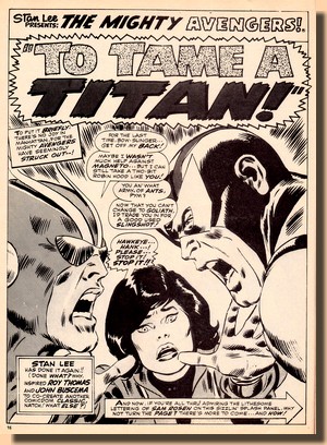
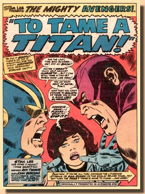
| Starting out with
reprinting the first half of an original
US issue was, naturally, the easiest way
for Marvel UK editorial to handle things,
and the Avengers feature thus kicked off
with the original splash page and story
title. However, comparing the original
colour material with the choice of
blacks, whites and greytones in the
Marvel UK reprints often revealed some
rather odd choices which would frequently
obscure the original artwork. Avengers
#66 actually displays very little of this
problem (quite unlike the preceding Avengers
#65), but the subject
found its way into its letter pages. 
|
|

|
|
|
| |
| In the case of this
splashpage, the one thing which stands out is that the
Wasp has clearly taken off her gloves in the UK reprint
version ... although, as the reply to this reader (who
obviously was well-versed with the original colour
material) pointed out, the tones were actually applied in
the New York offices. |
| |
 
|
|
True
to most of the late 1960s Avengers
material from Marvel, the story is told
swiftly (spiced up by the usual loud
disagreements between Hawkeye and other
team members), keeping a multi-issue plot
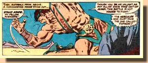
running at speed as Hercules wanders the
"unknown world", finds the
other Olympians, and is sent back to
Earth by Zeus to defeat Typhon - who is
wreaking sheer havoc and has overpowered
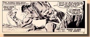
the Avengers... Leaving off the
original story midway rarely caused a
problem in terms of storytelling, as the
plot was paced in a way which almost
automatically gave readers a
mini-cliffhanger at the bottom of each
page. In this case, it was thus just the
very simple task of fitting in a caption
box which informed readers that this was
it for this week and what would happen next
ish.
|
|
|
| |
| Following this second
feature installment, Avengers #66 switches focus
again as the final pages are filled with martial arts
action. |
| |

"Massacre
Along the Amazon!"
Originally published in Master
of Kung Fu #24 (January 1975)
Script - Doug Moench
Pencils - Al Milgrom / Jim
Starlin /
Inks - Sal Trapani
Lettering - Dave Hunt
Original
page count: 18
Reprinted pages: 9
|
|

|
|
| |
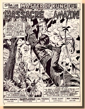
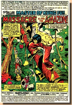
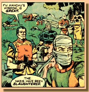
| Reprinting
a story which was told over two original
issues (Master of Kung Fu
#23-24) this was part 3 of 4 in the UK
installment format and therefore did not
require any custom made splashpage as the
original from Master of Kung Fu
#24 could be used with only minor
alterations (which basically meant
dropping the masthead text along with the
credits for colouring). Nayland
Smith and Shang-Chi have previously
travelled to South America in
pursuit of Fu Manchu where the evil
genius seeks to acquire the plans for a
secret Nazi weapon, held by a former
Gestapo agent named Bucher who fled to
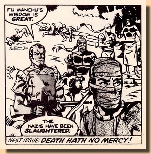
Brazil after the war. Now Shang-Chi is
lying in ambush in the Amazonian jungle
and takes out and poses as one of a group
of Si-Fan assassins making their way to
Bucher's camp, where his group tries to
spring a trap on Fu Manchu - only to
discover that the evil genius is well
prepared and has himself taken preemptive
measures, wiping out the Nazis in a
deadly crossfire... to be continued.
Doug
Moench's earlier Shang-Chi stories
focused heavily - and in interesting ways
and plots - on the difficult relationship
between Fu Manchu, who was the evil
mastermind and leader of a gang of cold
blooded and sworn assassins but who was
also the father of Shang-Chi, adding a
very special dramatic twist to this fight
between good and evil.
|
|

|
|
|
| |
| Shang-Chi's contradictive
sense of duty and loyalty towards his father would become
the focal point once more in the next issue of Avengers
as the Amazon story reached its climax with Fu Manchu
falling into the hands of Bucher and Shang-Chi the only
one who can save his father's life. |
| |
 
|
|
Which,
by way of logic of fighting for good, he does -
only to find that Fu Manchu has managed, once
more, to escape... The frequent use of
characters from Sax Rohmer's original novels
during the early years of Master of Kung Fu is
what prevents Marvel from reprinting and
collecting this material today, simply because
the House of Ideas no longer holds the rights to
these properties. Strangely enough, the reference
to this literary source present on the original
splashpage was omitted from the UK reprint
version.
Triggered by the
full-blown (and mostly Bruce Lee-fuelled)
"karate craze" of 1972/73 and first
introduced in the UK in Avengers
#28 in March 1974, the Shang-Chi
feature was as close to contemporary material as
Marvel UK could get - and this quickly turned
into a problem. Due to the weekly publication
schedule and the resulting reprint of two
original US issues in one single month, the Master of Kung
Fu stories had by now virtually
caught up with the original material. Although
January 1975 was the cover date for Master of Kung
Fu #24 and thus meant that this story had in
fact been in the hands of readers in the US in
October 1974, this was now definitely too close
for comfort for Marvel UK's editorial workflow.
The end of the Amazon story arc proper was
followed by what could be seen as an "Amazon
epilogue story" from Master of Kung Fu
#25, reprinted in Avengers #68-69 before
the temporary demise of Shang-Chi as of Avengers
#70, replaced by another Marvel martial arts
character, Iron Fist, who had already served as a
stand-in feature in Avengers #52-59.

|
|
| |
Surprisingly
enough, no indicia is included in The Avengers
#66, but like the previous and the following issue it was
edited by Matt Softely (who in reality was Maureen Softly) and printed in Ireland. It features
a full page Bullpen Bulletin as well as one and a half Avengers
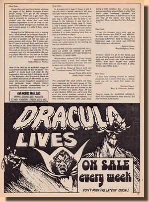
Assemble! pages of letters, and the readers'
attention was drawn, by means of in-house adverts, to
Marvel UK's weekly titles Mighty World of
Marvel and Dracula Lives.
|
| |
 |
| |
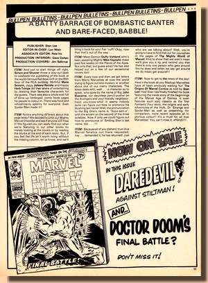
| The Bullpen Bulletin gave
readers a "batty barrage of bombastic banter and
bare-faced babble" (an excellent example of how
Marvel UK brought its US house style to the British Isles)
in the original tone of Stan Lee's friendly chatter as he
engaged in a conversation with friends. Much of that
information pertained to individuals and events across
the Atlantic, but there was also a British element
involved, such as the welcoming announcement for Duffy
Vohland, who would go on to become the US editor (and
later associate editor) of Marvel UK from 1974 to 1976
(Kirby, 2013), plus a plug for Stan Lee's Origin of
Marvel Comics book - and even a clarification of how
to pronounce John Buscema's name ("byoo-sem-a"). |
| |
   |
| |
 
|
|
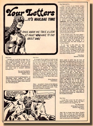
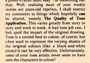
Apart
from the usual commentaries on the likes and
dislikes of readers concerning characters,
stories and art, the letters pages of Avengers
#66 also featured an interesting point raised by
a reader who obvioulsy had some familiarity with
the original US material: the quality of tone
application. The
original colour material was never reprinted by
simply reducing the pages to black and white - it
was reworked to a certain extent to make sure
that details of the artwork weren't simply
obliterated by the fact that certain colours are
reduced to the same graytones.
This was done by
adding "tones" - and just as reader
Chris Hard pointed out, the application of this
technique produced some rather odd results at the
time when compared to the original material, to
the extent where an image was actually changed to
produce a wrong impression (such as the example
of the Wasp's gloves mentioned above).
Interestingly, this
was not the result of work done by someone in the
UK who didn't really know the original material
too well, as the reply from editorial informed
readers that the tones were actually applied by
Marvel staff in New York. In addition, it pointed
out that the printing process used for Marvel
UK's weeklies did not allow for half-tones.
This was a point
which caused quite a bit of concern amongst the
more experienced readers throughout 1974 and
1975, but eventually Marvel UK improved the
graytone rendition in its printing and the
problem disappeared. Another concern which was
often raised throughout this period was the
problem of availability in some places where
seemingly distribution was not always fully
guaranteed.
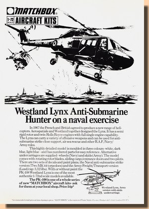
One page featured a
third party advertisement by regular advertiser
Matchbox, providing some period flavour from
today's perspective and showing how popular
military models were at the time.
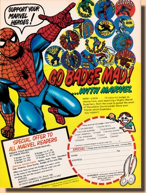
And finally,
absolutely identical to the preceding
week's Avengers
#65, the back cover in its full
splash of glorious colour advertised badges
featuring some of Marvel's best known superheroes.
They were available, by mail order, directly from
Marvel Comics Ltd, which at that time had their
offices in Room 109 at 52 High Holborn in Central
London.
|
|
| |
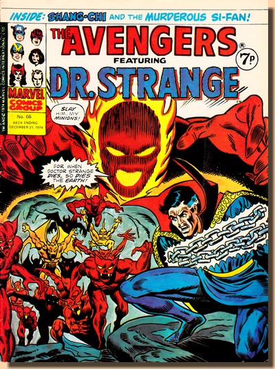
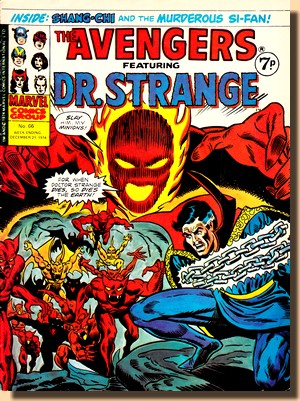
| Up
until Avengers #52 cover
appearances had first been dominated by
Earth's Mightiest Heroes themselves
(issues #1-27) and then Shang-Chi, Master
of Kung Fu (issues #28-51) until the
latter was replaced with Iron Fist who
took cover billing as the newly
introduced feature. From that point on,
the three features of the title took
regular turns in appearing on the cover;
Doctor Strange's debut came with Avengers
#54, and Avengers #66 was his 5th spotlight appearance
up front in glossy colours. The previous four
cover appearances of Dr Strange had been
a reworked cover of Strange Tales
#166 and straightforward cover reprints
from Doctor Strange #169, 170
and 172, but the Sorcerer Supreme's cover
for Avengers #66 features
original artwork by Ron Wilson (pencils)
and Frank Giacoia (inks) produced
especially for Marvel UK.

|
|

|
|
|
| |
| |
| BIBLIOGRAPHY KIRBY Rob (2013)
"The Mighty World of Marvel UK", in Back
Issue #63, April 2013
|
| |
First
published on the web 2 April 2015
Text is copyright (c) 2015

|
|


