 |
 |
|
BATMAN,
PHANTOM STRANGER &
WONDER WOMAN
BACK
TO BACK IN A
MARCH
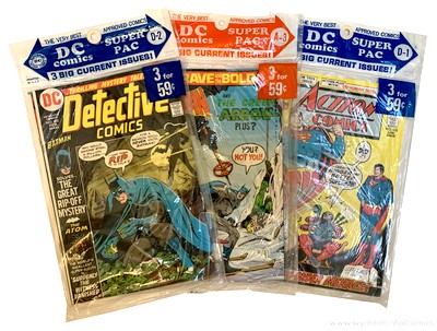
1973 DC SUPER PAC
|
|
|
|
| |
|
| |
|
| |
|
| |
| In spite of
the hugely successful comeback of the superhero genre in
the early 1960s, the comic book industry had a problem:
its traditional sales points were fading away. Small
stores that had carried comic books were pushed out of
business by larger stores and supermarkets, and
newsagents started to view the low cover prices and therefore
tiny profit margins comics
had to offer as a
nuisance. Comic book
publishers needed to open up new sales opportunities and
and tap into a new customer base. One place these
potential buyers could be found was the growing number of
supermarkets and chain stores. But in order to be able to
sell comic books at these venues, the product would have
to be adjusted. |
| |
| Handling
individual issues clearly was no option for these
outlets, but by looking at their logistics and
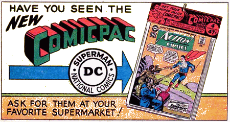
display characteristics, DC Comics (who came up
with the Comicpac concept in 1961) found
that the answer to breaking into this promising
new market was to simply package several comic
books together in a transparent plastic bag. This
resulted in a higher price per unit on sale,
which made the whole business of stocking them
much more worthwhile for the seller. The simple
packaging was also rather nifty because it
clearly showed the items were new and untouched,
while at the same time blending in with most
other goods sold at supermarkets which were also
conveniently packaged.
|
|
 |
|
| |
Outlets were even supplied with
dedicated Comicpac racks, which enhanced the
product appeal even more since the bags containing the
comic books could be displayed on rack hooks in an
orderly and neat fashion. It almost
became an entirely different class of commodity,
and offered parents (and their kids) the opportunity and convenience to pick
up a few comics at the same time they were doing their
general shopping.
"DC's focus [for
the Comicpac] was on both the casual reader and the
parents and grandparents who were looking for
gifts." (Wells, 2012)
DC's "comicpacks" were
a success, and other publishers quickly started to copy
the concept.
|

|
|
"The
DC [comic packs] program lasted well
over a decade, with pretty high
distribution numbers. The Western
program was enormous - even well into
the '70s they were taking very large
numbers of DC titles for distribution
(I recall 50,000+ copies
offhand)." (Paul Levitz, in
Evanier 2007)
By the early
1970s, DC relaunched their comic packs,
calling them DC Super Pacs, and
they continued to sell well.
Unlike comic books
distributed to news stands and other
traditional outlets, comic packs were
non-returnable. Bags that didn't sell
were thus the retailer's problem, not the
publisher's (leading some distributors
and retailers - who most likely had
previously rigged the returnable comic
scheme, e.g. by selling comic books
without their covers - to simply split
the packs open and return the loose
comics).
|
|
|
| |
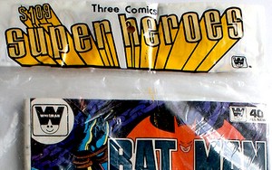
| The only way to stop such illegal
behaviour was to make comic books contained in
comic packs distinguishable from regular news
stand editions - and Western, the largest
distributor of comic packs, did just that as of
1972 by introducing their logo on the cover. DC titles distributed by
Western in their own comic packs featured the
Western "smiling face" logo instead of
the DC roundel; the covers would also not show
the issue number and the month.
DC's own comic packs,
however, continued to contain regular news stand
editions only throughout the 1970s.
|
|
 |
|
| |
|
| |
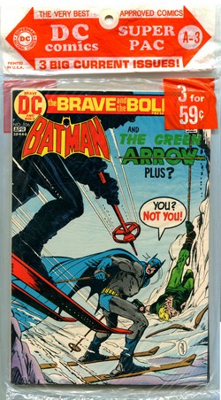
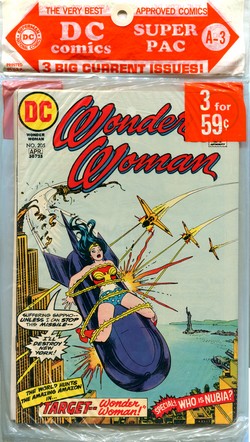
| This March (A-3) 1973 DC SUPER PAC contains three bi-monthly
titles: Brave and the Bold #106, Phantom
Stranger #24, and Wonder Woman #205. DC handled its multi-comic packs in a
very structured and organised manner; an A-3 pack from a
specific year would carry the same titles and issues no
matter where or when it was sold (rare packaging errors
aside). The digits (1-12) referred to the month and the
letters (A through D) marked the four different packs per
month. "A-3" therefore denotes the third March
SUPER PAC, in this case from 1973. |
| |
| No titles had
permanent slots in the SUPER PACS, although there was a
high level of consistency with DC's flagship characters (the
SUPER PACs of 1973 contained complete runs
of Superman and Batman as well as the
Batman team-up title Brave and the Bold). But since sales points could vary a
lot with regard to their supplies and selection of SUPER
PACs, the availability of specific titles was never
guaranteed - the common fate
of many comic book readers in the 1970s, whether their
comic books came packaged in a plastic bag or as single
issues from a display or spinner rack. In the case of DC titles this mostly
wasn't a problem anyway. Unlike their major competitor
Marvel, DC's editorial at large still very much embraced
the "single issue, done in one" storyline
principle during the early 1970s, so it often didn't even
matter in which sequence you read your copies of Batman
or Superman, since every issue would generally
start with a brand new story.
|
| |
|
| |

|
|
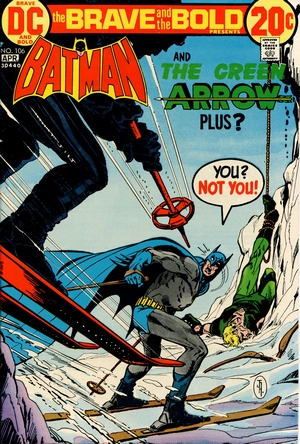
BRAVE
AND THE BOLD #106
March/April 1973
(bi-monthly)
On Sale: 2 January 1973
Editor
- Murray Boltinoff
Cover - Jim Aparo (pencils & inks)
"Double Your Money --
And Die!"
(23.3 pages)
Story - Bob
Haney
Pencils -Jim Aparo
Inks - Jim Aparo
Lettering -
Jim Aparo
Colouring - NN
PLOT SUMMARY - As the main
shareholders of the Starr Corporation are
being killed one after the other, Batman
and Green Arrow travel to Switzerland on
the trail of the mastermind behind the
killings - only to discover a familiar
Batman foe at the centre of it all:
Two-Face!
|
|
|
| |
| The Brave and the Bold
started out as a bi-monthly anthology in August 1955,
featuring characters from past ages such as Vikings,
Knights, and even Robin Hood. Following DC's successful
attempts at reviving and updating superheroes from the
Golden Age (kick-started by the Flash in Showcase
#4 in October 1956), Brave and the Bold was
changed into a try-out title as of issue #25 (August
1959), presenting a succession of (mostly successful) new
concepts which would often move on to their own title,
such as the Justice League of America in Brave and
the Bold #28 (February 1960). |
| |
| Having
previously already run a few team-up stories, Brave
and the Bold #59 (April 1965) featured
Batman for the first time. With the TV series and
the subsequent "Batmania" in full
swing, Brave and the Bold became a
dedicated Batman team-up title as of issue #74
(October 1967). It embarked on its own path of
success and became a monthly title as of Brave
and the Bold #118 (April 1975), ultimately
clocking up 200 issues until its demise in July
1983.
The title owes much of its renown and fan
interest to the fact that it was the first to
feature Neal Adams' version of the Batman, in a
team-up with Deadman in Brave and the Bold #79
(August 1968). Adams (1941-2022) went on to
provide both the covers and the interior artwork
for the next seven issues of Brave and the
Bold (followed intermittently by a few more
covers), and his style continues to define the
iconic popular culture Batman image to this day.
Whilst Adams' impact on Batman unfolded over
just a handful of issues of Brave and the
Bold, the opposite was the case for the
writer who penned those stories: Bob Haney.
|
|
 |
|
| |
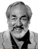
| Robert G. "Bob" Haney
(1926-2004) started working in the comic book industry in
1948 and joined DC in 1954, where over the next 30 years
he scripted just about every sort of comic book DC
published (Evanier, 2004). |
| |

Bob Haney
(1926-2004)
|
|
Sometimes called
"Zany" Haney, he was in actual fact one
of the few people at DC in the mid-1960s who
"understood
that Marvel was successfully reinventing the
super-hero comic for the current
generation" (Evanier, 2004)
Haney almost desperately
tried to bring some of that "Marvel
flavour" to the stories he was writing for
DC, and that included his very own (and sometimes
completely off-target) version of Stan Lee's
hyperbole. But Haney understood that readers
expected the writers of the comic books they were
buying to connect with them, and whilst he could
not make DC look like an exclusive secret club
the way Marvel portrayed itself, addressing
readers as "faithful ones" was
definitely a step in the right direction.
Haney's first script for Brave
and the Bold went back to issue #4 and
February 1956, and he quickly became almost a
part of the inventory of the title - so much so
that the letters page of Brave and the Bold
#146 (January 1979) informed readers that Haney
would be taking his first holiday break in ten
years and therefore miss out on scripting issue
#147.
|
|
| |
For a number of years, Haney made Brave and the
Bold (and the Batman character featured in those
team-up stories) his very own - not the least because he
had come up with the concept in the first place when the
title had experienced sagging sales.
"I soon realized that a super-hero
team-up concept was the only way to revitalize
the book. I needed a wheelhorse. Superman was
out. His editor jealously guarded that empire. So
Batman became the B&B mainstay. It worked.
Without him or with some minor or non-super
teammate, sales would tumble. So I pursued a
policy of repeated link-ups with those characters
the readers obviously favored via their sales
response." (Bob Haney in
Best of the Brave and the Bold #5, 1988)
|
| |
| Haney cared very little about the
conventionalities of the DC Universe and would sometimes
even write stories which outright contradicted them - so
much so that Haney's Brave and the Bold Batman
would be deemed to be living in an alternate reality
called "Earth-B" (Eury, 2013). |
| |
It was Haney's very
own idea of what he (along with, he assumed, a
lot of fans) wanted the Batman to be, and he
found the perfect artist for this venture in Jim
Aparo.
"I wanted the spooky dark night
Batman image of his original days. Such
artists as Neal Adams and the redoubtable Jim
Aparo brought this vision to panelled
reality." (Bob
Haney in Best of the Brave and the
Bold #5, 1988)
Jim Aparo had
started working for Charlton Comics in 1966 (as
one of very few artists who would pencil, ink,
and letter their work) before moving on to DC in
1968 (where he worked almost exclusively for the
remainder of his career).
What started
out as a fill-in job for Brave and the Bold #98
(October 1971) turned into an impressive run as
the principal artist for the title throughout the
Bronze Age - ultimately pencilling almost all of
the second one hundred issues of the title.
|
|

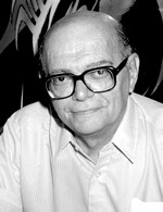
Jim Aparo
(1932-2005)
|
|
| |
| Haney could whip up tightly
plotted scripts (e.g. his classic Brave and the Bold
stories illustrated by Neal Adams) just as easily as he
could throw out extremely loose ones with lots of logical
holes and very little overall sense. Brave and the
Bold #106 is situated somehwere in between these two
benchmarks - it's fast paced and serves up an exciting
Batman story as long as you just go with the flow and
don't ask too many questions. |
| |

|
|
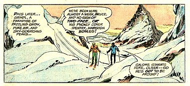
From time to time
Haney would also shift events away from
Gotham, and in the case of Brave and
the Bold #106, he sends Batman and
Green Arrow to Grindl (most likely
derived from Grindelwald), Switzerland.
The small Alpine country featured fairly
often in Batman stories of the 1970s and
1980s, either due to its secluded valleys
or its secretive bank
accounts. Bob Haney himself would
send Batman to Switzerland again,
together with the Atom, in Brave and
the Bold #152 (July 1979). And last
but not least, this choice of location
gave Jim Aparo the chance to draw
Matterhorn-lookalike mountains. |
|
|
| |
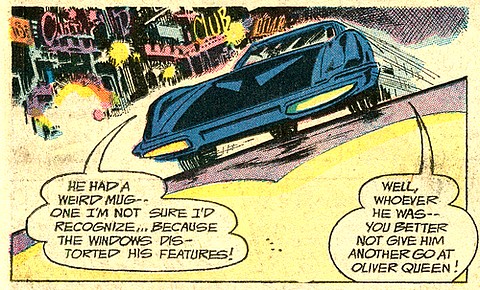
| Whilst Bob Haney certainly had a
vivid imagination, it was Jim Aparo's artwork that
ultimately brought it all to life, and his highly dynamic
style epitomized everything that would become the classic
1970s Batman look and feel. |
| |
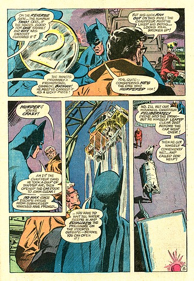
| Aparo was a
master at perspective, and although usually
employing fairly conventional panel set-ups his
constant switching of the reader's viewpoint,
combined with his keen sense for storytelling,
made his art feel very cinematographic. Sometimes
his panels jumped right out at you, sometimes
they just drew you in. It was, quite simply,
Batman at his best. Aparo's work was so
consistently solid because he would very often
both pencil and ink his work, giving him full
creative control. And whilst taking some
inspiration from Neal Adams' redesigned Batman,
Jim Aparo developed his own typical visuals, such
as longer pointed ears on the cowl, a seamless
transition between the mask and the cloak, a
smaller oval bat insignia, and a pointedly square
chin.

|
|
 |
|
| |
Jim Aparo admired Neal Adams, but it worked both
ways.
"[Adams] was
influencing everyone. He was a big influence on me.
And as good as he was, he'd been waiting at Dick
[Giordano]'s office to wait and see what I was
bringing in. Neal claimed he was a big fan of mine.
Can you believe that? He was quite a guy!"
(Aparo in Amash, 2000)
|

|
|
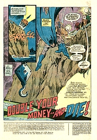
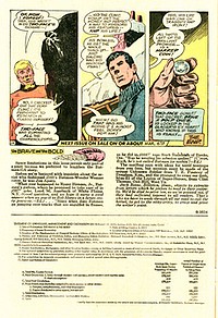
The story
told in Brave and the Bold #106
concludes on a half-page, which also
contains a highly squeezed down letters
column (more of a recap of letters
received than actual printed missives
from readers). This is mainly due to the
fact that one third of the page is taken
up by the "Statement of ownership,
management and circulation". The postal services
had required a published statement of
ownership since the 19th
Century from all publications that were
shipped Second Class, but as of 1960
publishers were also required to list
their average circulation for the year.
It is a fair guess
to assume that most readers of Brave
and the Bold #106 at the time gave
these numbers only a cursory glance (if
at all), wishing the space had been used
for more "comic book content".
Today, however, those statements of
ownership and circulation in comic books
are quite fortuitous, allowing us an easy
glimpse into print runs and sales of
earlier eras.
As far as Brave
and the Bold was concerned, the
numbers nearest to the filing date were
on the up compared with the average of
the preceding 12 months: 397,000 copies
printed (compared to the average
351,000), of which 208,456 copies in paid
circulation (179,609).
|
|
|
| |
| As was typical for the early
1970s, the attrition rate in terms of distributed but
unsold copies was terrible: totals of 186,550 (nearest to
the filing date) or 170,212 (average of the preceding 12
months) meant that a whopping 45+ percent of the print
run never made DC any money. And it was the same for all
comic book publishers across the board. The problem
really stemmed from the traditional distribution model
with returnability. The fact that the loss incurred by
unsold copies was on the publishers, not the distributors
or sales points, was a breeding ground for an attitude of
"we couldn't care less" when it came to
actually selling the product.
"A few retailers actually liked carrying
comics, but most were indifferent (...) So, let’s
say [the local distributor] actually delivered 5,000
copies [of 10,000 received at the warehouse] to the
retailers - if they bothered to deal with unwrapping
and sorting, if they had room on the trucks… Most
likely, they’d only actually deliver comics to
retailers who would complain if they didn’t get
comics and places that sold enough comics to make the
driver’s effort worthwhile." (Shooter,
2011)
Another huge problem were the
fraudulent practices it attracted.
"We [at Marvel]
actually found a company that was sending back more
copies than we shipped them. We found out there was a
printer in Upstate New York that was printing copies
of our covers to sell back to us (...) At the time we
had something like a 70 percent return rate"
(Galton in Foerster, 2010)
It all became completely untenable
by the time the 1970s rolled around, and it became the
impetus for the creation of "comic packs" such
as DC's Super Pacs and the direct market.
|
| |
| |
|
| |

|
|
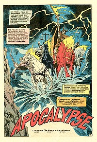
PHANTOM
STRANGER #24
March/April
1973
(bi-monthly)
On Sale: 4 January 1973
Editor - Joe
Orlando
Cover - Jim Aparo (pencils &
inks)
PHANTOM
STRANGER: "Apocalypse"
(17
pages)
Story
- Len Wein
Pencils & Inks - Jim Aparo
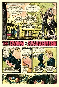
FRANKENSTEIN
: [No Title]
(5.5
pages)
Story
- Marv Wolfman
Pencils & Inks - Mike Kaluta
PLOT
SUMMARIES
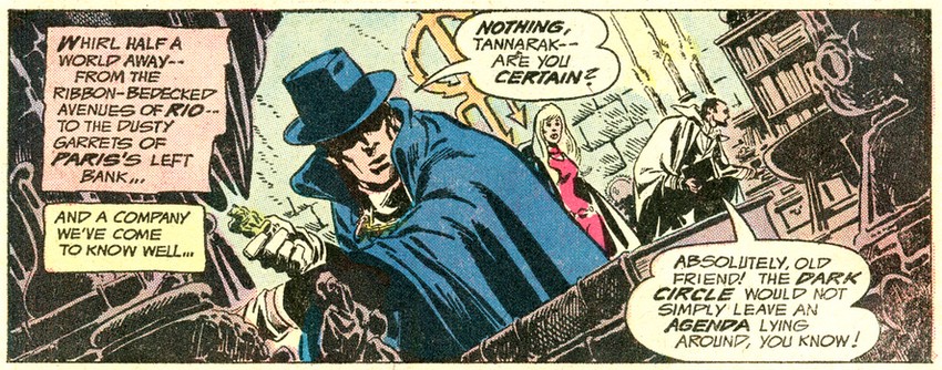
- The Phantom Stranger,
Cassandra, and Tannarak travel to
Rio De Janeiro to track down the
Dark Circle and stop them from
summoning the Four Horsemen of
the Apocalypse to bring about the
end of the world.
Dr. Thirteen vows to track down
and destroy the Spawn of
Frankenstein, whilst the Monster
is out body-snatching.
|
|
|
|
| |
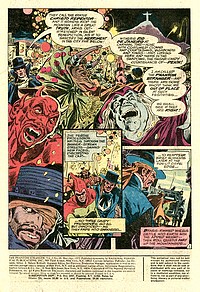
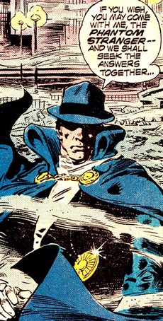
| The Phantom
Stranger, created by John Broome and Carmine Infantino in
1952, is one of only a handful of comic book characters
which truly elude a clear-cut characterization: Having
originated from unspecified paranormal
circumstances, he battles mysterious and occult forces,
but his identity and motives ultimately remain unknown
and unclear. |
| |
| This air of vagueness surrounding
the Phantom Stranger is sometimes mirrored in his
stories, which back in the 1970s (in which was
actually volume 2 of the series) could take on
all kinds of differing tones and directions. After
the title was relaunched for a second volume in
May 1969, Jim Aparo took over from Neal Adams and
Mike Sekowski as interior penciller with issue #7
(May 1970) and continued to provide the artwork
for the stories until issue #27 (October 1973).
Another identifying
trait of the Phantom Stranger is his role of
narrator and host, a concept which framed all the
stories of the second volume. It was a plot
device taken straight from old time radio shows
of detection, mystery and horror, where listeners
would be both warned and invited to witness what
was about to unfold.
|
|
 |
|
 |
|
| |

|
| |

Phantom
Stranger #35, Gerry Talaoc
|
|
And just as had been
the case with those
old radio shows, the fact that the
Phantom Stranger was host and narrator as
well as involved character didn't always
guarantee a very active role in the
actual storyline.
"The Phantom Stranger
never really got noticed by most of
the audience because it was a mystery
book, not really a character book.
The Phantom Stranger was rarely the
focal point of the story. He was the
host, he was the interlocutor, the
interjector, he just showed up at the
right moment, and ran away." (Len
Wein in Slifer 1979)
This was also a
constant point raised in letters sent in
by readers. Some did not like the artwork
once Jim Aparo stopped doing the
interiors, whilst others did not approve
of some recurring characters which
writers had started to introduce later on
in the run. But they all seemed to agree
that they wanted the Phantom Stranger to
play a more active role in the stories.
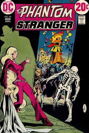
The strength of
the Phantom Stranger lies mostly with the
character concept and the visuals. And
once again, Jim Aparo - taking over the
relay baton from Neal Adams with Phantom Stranger
#7 in early 1970 - made the
character his unmistakable own through
his mysteriously atmospheric pencils and
inks. Adams continued to provide the
covers until Aparo took over that task as
well as of Phantom
Stranger #20 (July 1972), and in a
similar fashion continued to provide
cover artwork once he left the title's
interior pencils and inks after issue #26
(August 1973).
His successor, Gerry
Talaoc, was a vanguard of Filipino
comics artists recruited in the early
1970s, and although providing solidly
attractive artwork was not held in the
same high esteem as Aparo by the readers.
|
|
|
| |
| The Phantom Stranger had
initially reprinted 1950s Dr Thirteen material from Star
Spangled Comics as a back-up feature and then went
into ever-changing set-ups with only original Phantom
Stranger material, re-introducing Doctor Thirteen as
secondary feature with original material pencilled and
inked by Jim Aparo, and reprints. |
| |
| As of Phantom
Stranger #12 Doctor Thirteen again became a
regular (original material) second feature, with
occasional reprints from titles such as House
of Secrets or House of Mystery
thrown in for single issues. Starting out in Phantom
Stranger #23 (January 1973), (Spawn of)
Frankenstein replaced Doctor Thirteen. Based on a
concept by Len Wein, scripted by Marv Wolfman,
and illustrated by Mark Kaluta, this was
essentially DC's version of Mary Shelley's
creature, revived in the US by a certain Victor
Adam. The Monster (the "Spawn of
Frankenstein" in DC's labels) kills Adam but
also accidentally causes Dr Thirteen's wife to
fall into coma - and the connections to the DC
Universe are forged. But in the end, DC's
Frankenstein Monster turned out to be even less
successful than Marvel's
version (which at least clocked up 18 issues
between May 1973 and September 1975).
Spawn of Frankenstein was the back-up feature
for eight issues until being replaced by Black
Orchid as of Phantom Stranger #30 (June
1974).
Phantom Stranger, always a bi-monthly
title, was cancelled with issue #41 (February
1976).
|
|
 |
|
| |
As editor Joe Orlando put it in
his cancellation annoucnement on the letters page:
"As longtime readers know, P[hantom]
S[tranger] has always been a marginal title,
prospering at times, but usually just hanging on.
It's been nearly cancelled more times than we can
remember, and as of this issue it will finally vanish
for ever. It's a pity, and none of you feel it
anymore than we do, but we have no choice... sales do
not warrant the continuation of this mag."
|
|
 |
|
In
keeping with its fringe status,
current data available only lists
two issues (#24 and #33) of Phantom
Stranger carried in a
SUPER-PAC. |
|
|
|
| |
|
| |

|
|
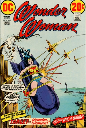
WONDER WOMAN
#205
March/April
1973
(bi-monthly)
On Sale: 4 January 1973
Editor -
Robert Kanigher
Cover - Nick Cardy (pencils &
inks)
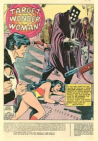
WONDER
WOMAN: "Target Wonder
Woman!" (16 pages)
Story - Robert Kanigher
Pencils - Don Heck
Inks - Bob Oksner
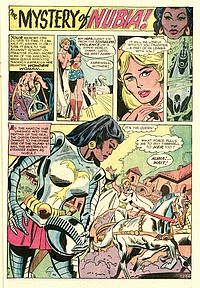
WONDER
WOMAN: "The Mystery of
Nubia!" (7 pages)
Story - Robert Kanigher
Pencils - Don Heck
Inks - Vince Colletta
PLOT
SUMMARIES - A
terrorist named Dr. Domino tries
to extort information on a deadly
weapon by tying Wonder Woman to a
missile and launching it.
On the Amazon's Floating Island,
the mysterious Princess Nubia
stops a fight between two rivals
for her hand by offering to fight
one of them herself.
|
|
|
|
| |
| Wonder Woman
is considered to be one of DC's "big
three" (along with Superman and Batman),
dates back to 1941, and was one of the first
female superheroes. She is also rather unique in
having been created not by a comic book writer
but by a psychologist - and that's also where the
problems start. American psychologist and
writer William Moulton Marston was an early
supporter of equality between men and women
(hence the creation of Wonder Woman).
Unfortunately, Marston was also a bondage
enthusiast in his private life, and rather than
keeping this predilection to the world of
consenting adults, he brought it to comics and
constantly had Wonder Woman, along with all the
other Amazons, tied up. And as for the imperative
flaw that every superhero required, Marston
stipulated "Aphrodite's Law" which made
Wonder Woman lose her Amazonian super strength
when her "bracelets of submission" were
chained together by a man.
|
|
 |
|
 |
|
| |
| Once Marston was no longer
involved in the creative process behind Wonder Woman,
it was all toned down very quickly - which also meant
that both the heroine and her title were on a zig-zag
path with very little clear direction. |
| |

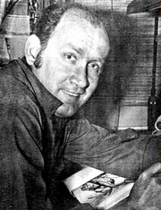
Don
Heck
|
|
Back in the 1960s, Don
Heck had co-created Marvel's Iron Man and
drawn the Avengers and X-Men, but growing
increasingly unhappy with a dwindling
workload at the House of Ideas by the
early 1970s, he started doing work for DC
- at the suggestion of Jack Kirby.
"Carmine
[Infantino] was speaking with Jack
[Kirby] and mentioned he was having
difficulty finding the right artist
for the Batgirl series. Jack told him
'Why not Don Heck? He draws the
prettiest girls in comics.'" (Mark
Evanier in Coates, 2014)
Heck was
immediately put to work on various titles
featuring female protagonists, including Wonder
Woman. The problem with that title
was that it was a perennial low-selling
book.
"I
heard from someone at DC that the
daughter of the creator of Wonder
Woman has this sort of sweetheart
deal where (...) to fulfill the
lifetime contract they have with her,
they have to publish Wonder Woman, no
matter what." (Will Murray
in Coates, 2014)
|
|
|
| |
Heck recalls an
experience very much in line with such a
potential premise; at first being enthusiastic to
draw one of DC Comics' iconic characters, he
found that in his first meeting with the series'
writer
"He
looked at me like we had just won the booby
prize." (Heck in Coates, 2014).
Heck also drew the back-up feature "The
Mystery of Nubia" for Wonder Woman
#205.
This issue contains the compulsory annual
statement of ownership and circulation, but
whereas the total number of printed copies
nearest to the filing date is similar (362,000)
to those of Brave and the Bold
(397,000), the average of the preceding 12 months
(281,000) is decidedly lower (351,000). But worst
of all, the attrition rate of unpaid copies is
above 50%.
Incidentally, the well-known TV show Wonder
Woman, starring Lynda Carter, was also just
as much a middle of the road thing. Inspite of
its fanbase, the show only had decent ratings
when it aired from November 1975 to September
1979 (Hanley, 2014).
|
|
 |
|
| |
|
| |
| FURTHER
READING ON THE THOUGHT
BALLOON |
| |
| |
 |
|
"Comic
packs" not only sold well
for more than two decades, they
also offer some interesting
insight into the comic book
industry's history from the 1960s
through to the 1990s. There's
more on their general history here. |
|
|
|
| |
| |
|
| |
BIBLIOGRAPHY
| |
| |
| AMASH
Jim (2000) "The Aparo Approach", Comic Book
Artist #9, TwoMorrows Publishing COATES
John (2014) Don Heck - A Work of Art,
TwoMorrows Publishing
EURY
Michael (2013) "The Batman of Earth-B",
Back Issue #66, TwoMorrows Publishing
EVANIER
Mark (2004) "On the Passing of Bob
Haney",
News from Me, 7 December 2004
EVANIER
Mark (2007) "More on Comicpacs", News From Me,
2 May 2007
FOERSTER Jonathan
(2010) "Marvel Comics' miracle
man set up business' success", Naples Daily
News, 30 May 2010
HANLEY,
Tim (2014). Wonder Woman Unbound: The Curious
History of the World's Most Famous Heroine,
Chicago Review Press
SHOOTER Jim (2011)
"Comic Book Distribution", jimshooter.com,
15 November 2011
LIFER Roger
(1979) "Lein Wein Interview", The Comics
Journal #48
WELLS
John (2012) American Comic Book Chronicles:
The 1960s (1960-1964), TwoMorrows Publishing
|
|
| |
| |
|
| |


|
| |
|
| |

(c) 2024
uploaded to the web
14 June 2024
|
| |
|
| |
|

